Here you’ll find an assortment of logos and brands that I’ve helped create.
The Murmur Logo
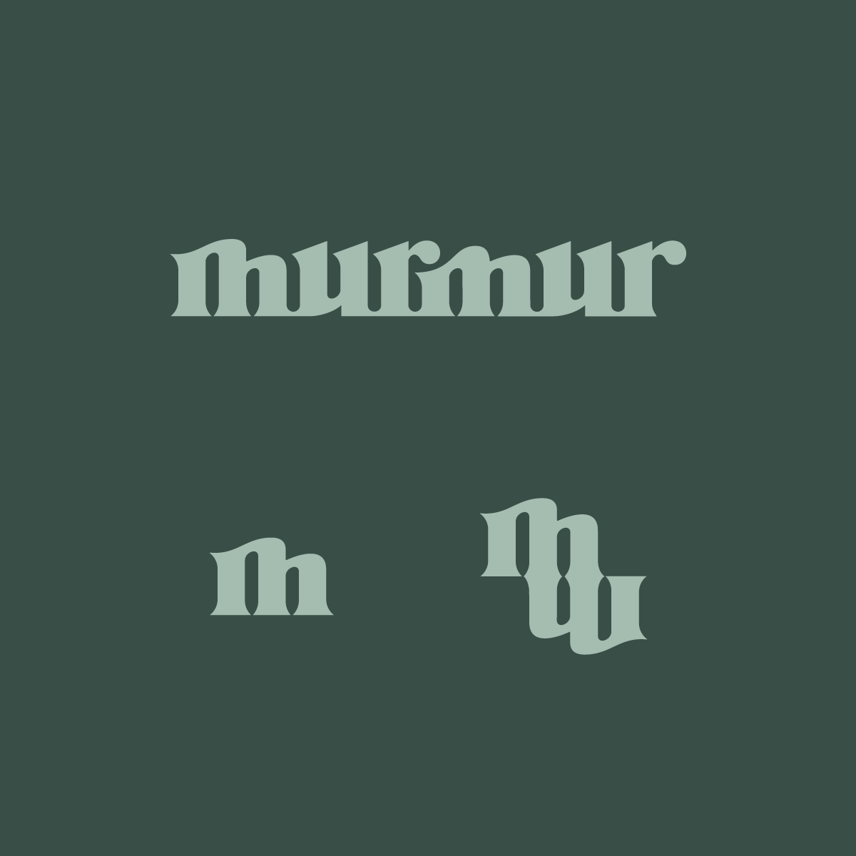
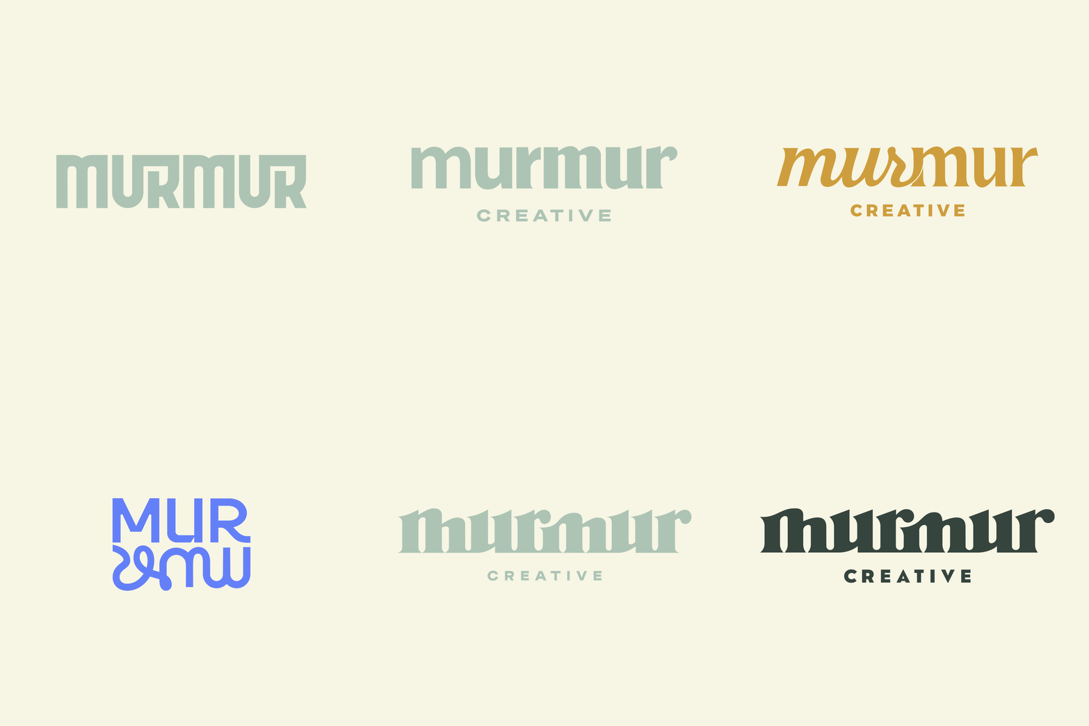
This one was personal! Having worked at Murmur Creative for around 5 years, it was a blast to dig in and work on what would become our new logo. From typographic styles to visual devices, we explored all the ways to convey change, transition, connection, travel, and guidance through typography alone.
There’s a rhythm and a pathway to the shape of the word, yet it sits on a solid foundation. All these little things, leading up to one big thing: an inclusive, approachable logo that sums up Murmur’s ethos of being your friendly force for good on the road to better branding.
In the below gif, you can see some unused marks that didn’t make the cut.




EDP Renewables
EDP Renewables is a large Portuguese renewable energy client, who’s often building wind farms and solar parks in America.
Partnering with them for all new projects on a local level was a fun exercise. One of the reasons it was often challenging was due to the logo marks needing to showcase a sun, solar panels, or wind turbines. Which meant that for all concepts and directions, we would have to find new ways incorporate the needed elements. While simultaneously create an engaging mark.




Sherwood School District
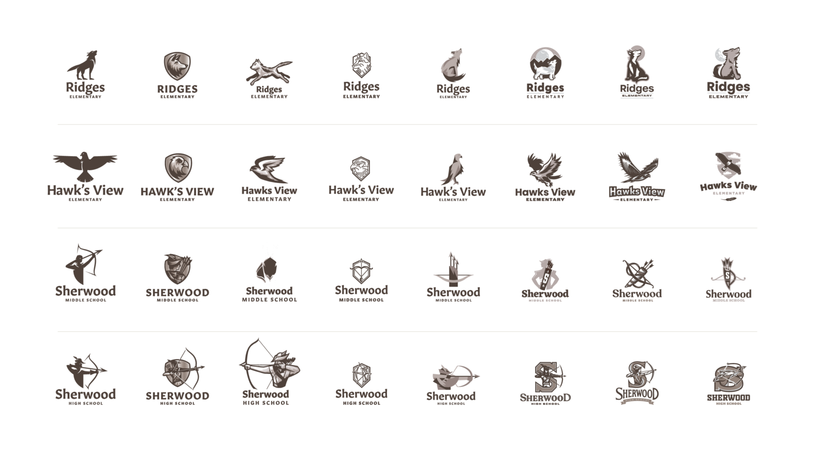
Sherwood School District needed to modernize two of their elementary schools, Jr. High, And High School logos. We worked on their District logo successfully, and were soon at the drawing board again. But this time with a focus on mascots.
We knew the subject matter for each school, but conceptually we had a lot of options that we could try. We explored illustrative iconography to more geometric stylizations. Below are some of those initial marks we created, with the chosen logo variations below.
